Coaching Print
Amatoritsero Ede in Conversation with Stan Bevington

Amatoritsero Ede: How would you say Coach House has changed or impacted the dynamics of Canadian printing and/or book production?
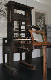
Stan Bevington: In 1965 the majority of books were typeset in lead on Linotype machines and a few high quality ones were typeset on Monotype machines. The technology of typesetting involved a professional typesetter and a production routine that included galley proofs and corrections. Galley proofs were printed on long sheets of newsprint and after they were corrected, page proofs were made. So the physical media that editors and authors worked with indicated a stage of production. I had training in operating a Linotype machine from working in country newspapers, and had the opportunity to buy a used Linotype machine for thirteen hundred dollars. The brass molds for the fonts of type cost about the same thing so I bought two typefaces: Helvetica, when it first came out in 1967, and a book typeface, Garamond Number 3. The very first book we did I hand typeset from single letters and printed from the lead letters, then put away the page of type and printed the next page. After that our little print shop followed the tradition of typesetting the pages in lead and making clean reproductions. So within a year I leaped ahead a hundred years of technology, went from the Gutenberg era to the Linotype era. We typeset Michael Ondaatje’s first book, Dainty Monsters, with our Linotype. This process was pretty standard for what other big publishers were doing. The difference is that McClelland and Stewart and Clarke Irwin and McMillan hired printers and typesetters to do that work, whereas we did it in house. So our early editorial policy involved a decision about whether the manuscript was worth putting in that much time on the Linotype. It was a big commitment of time. When authors came to visit our print shop they saw this amazing machine, and they found it exciting to see the actual production of their books.
A.E.: Your meeting with Prof Ron Baecker of the U of T in 1972 led to a collaborative technological effort, which pushed CH headlong into the digital printing age 40 years ahead of any other publisher in Canada. Could you give us an idea of the details? It certainly bears repeating.
S.B.: That was the beginning of computer controlled photomechanical typesetting. The newspapers were taking a leadership role in this because there was a strike in the typographic union; non-union workers were punching computer paper tape and feeding that into the typesetting machines and skipping the union workers. We had an opportunity to buy used paper tape punch machines and they had just introduced a relatively inexpensive phototypesetting machine. The phototypesetting machine had a film master and the light flashed through an original letter. A strobe light flashed the light through the letter, through some lenses, through some mirrors and onto photographic papers to create a film gallery proof. My interest was being able to have a wider range of typeface choices by making our own film masters of fonts. I visited Ron Baecker at the University of Toronto, where he was in charge of computer graphics. Together we got a grant to explore computer typesetting. Cartoon programs had a method of taking the outline and filling in the center. This was an advance for them, because they could avoid digitally storing every letter dot for dot, so the research project was a success on that level. Baecker offered me the opportunity of using a digitizing tablet and I chose the typeface Cartier as the first font to digitize. What I found amazing is that once you had digitized font you could make it lean over to become italic, or flat, or even backwards shadow. You had all those choices with one font. We were also connected to the Internet. Coach House was the first commercial company in North America to be connected to the university network, called DARPA at that time. We invited some artists, and formed a little group that fantasized about what the future should be like. We sent email messages around and discussed the issues and challenges of how text ought to be represented on a computer for ease of editorial work and produced a report for the Canada Council that said ‘this is what is likely going to come along and here are some opportunities.’
A.E.: In the 1970s, your deployment of the minicomputer 2200, to augment the prevalent Lino typesetting at the time and push the art of printing towards computer photo typesetting was certainly innovative and groundbreaking. How close did CH come to becoming a hardware/software producing company as well as printer and publisher?
S.B.: At a newspaper trade show we saw some examples of optical character recognition and also of interface between small computers and typesetting machines. We bought a relatively inexpensive Datapoint and a used photomechanical typesetting machine called a variable input phototypesetter, VIP, from Linotype. Then the senior programmer at the Globe and Mail, the senior programmer of MonoLino, and Ron Baecker and myself all talked about the feasibility of interfacing these two. Ed Hale from MonoLino made a special computer board with chips on it, hand-wired, and David Slocombe debugged the software. We made our phototypesetting machine read the paper tape, send it to the little computer where we could make corrections and then send the codes back to the typesetting machine. Our goal at that time was to produce full pages of text, whereas the industry was making pages of text and then re-typesetting correction lines and pasting them on. Since we were a full production house that went from typesetting to bound books, we noticed that the exposure on the correction lines was inconsistent and the shadows and cracks required a lot of extra hand work, so our goal was to make full clean pages of type.
A.E.: At some point CH was located on U of T grounds. Would you say that you were an unofficial university printing press? Did the informal collaboration with U to T professors involve you printing/publishing their books?
S.B.: In the 1980s we printed a few books for professors around University of Toronto. Because we had been involved as a beta test site for a relational database system at University of Toronto that was similar to what we now know as Oracle (Empress was a competitor to Oracle), we knew how to typeset from database. And we did some books that were more or less automatically formatted from reading database material and sending it to typesetting. One of them involved a lot of Greek, another involved condensing what would have been hundreds of pages of computer print out, and by typesetting it, was possible to make a paper edition at about a third the size of the book. We also printed college literary magazines. We printed the Trinity Review and Acta Victoriana and for St. Michael’s College. Over the years editors of each of those magazines moved along into their publishing careers, so we eventually knew most of the people in publishing. We didn’t do academic journals because the University of Toronto Press was well established in that area and we didn’t compete with the University of Toronto Press. There was one occasion when Acta Victoriana went to U of T to get their magazine published and the production manager at U of T said ‘Stan, take these kids back!’
A.E.: How would you say CH influenced the Canadian tradition of in-house, on-campus, university presses?
S.B.: The University of Toronto press during the seventies and eighties was perhaps unique in that they offered a full range of services under one manager, Harold Bohne They had an editorial office, a design office, a printing plant, and a bookstore. After Harold Bohne left things were broken up into individual components, and gradually the printing division became an independent company. In the 70s Talon, Vehicule, Porcupines Quill, and Tree Frog all had in-house presses. The strength of Coach House has been in being able to print relatively small quantities of books as they’re needed. We realized, very early on, that we should save our digital computer files, and we should save our film negatives, so that we could make reprints relatively easily and quickly. Although it’s a little more expensive to be going back on the press frequently for reprints, it decreases the risk factor dramatically. The traditional wisdom of publishing is that the more copies you print, the cheaper it is per copy. That concept was entirely wrong from my point of view. I proposed that for the first book it cost a certain amount that you couldn’t avoid, and after that the cost per copy, the running cost, was a straight line that stayed about the same. We were better off doing multiple reprints than a long press run. In calculating the real cost of a book you can’t just assume printing cost are cheap because you printed a lot of copies. Perhaps you printed a lot of copies and only sold half of them, so your unit cost was actually double. We took the low risk approach and we encouraged our print clients to take the low risk approach. And I have to say that most of my clients have been successful.
A.E.: The transition from traditional printing to more complex electronic process can of course not yet short circuit plate making and actual presswork. How do you combine traditional and new age technologies these days?
S.B.: As we went through the transition to photomechanical typesetting at Coach House, we had a batch of software that helped us prepare files to drive the print-out machine. Based on the advice of people from University of Toronto, we maintained our files as machine independent software. So there was one little filter that says ‘here’s what this printer needs,’ but the software itself, the core material, remained transportable over multiple computers and with multiple print-out machines. When the next generation of typesetting machines came along as used equipment, the CRT (Cathode Ray Tube) machines, they didn’t use film masters and the fonts were encrypted on eight-inch floppy disks. We only had to convert a little bit of our software, while the majority of our software continued working. And then along came Laser typesetter, and a similar thing happened, except the digital files were encrypted with the current standard postscript and the output was a laser beam. So we went through photomechanical typesetting, CRT typesetting, and digital laser typesetting using the same software with filters that made each one specifically work for our needs. We tried to let the input of our authors be independent of the print-out machine. We worked on this system that many large corporations in the United States were using called ‘Gen Code’ or Standard Generalized Markup Language (SGML) which was independent of any particular brand of equipment. At Coach House, we decided to put little codes with brackets around them and then our in-house programmer David Slocombe made a little smart chunk of software called a macro processor that translated the tags into codes needed for the particular typesetting machine at the time, specialized codes. So the macro processor at the time was revolutionary. It was like multiple automatic search and replace. We also had the advantage of the Unix operating system, which is currently being used on the Macintoshes. We had that in place and were using it in the mid seventies so we knew the correct approach to doing all these things, machine independent software and text processing rather than word processing. Currently we’re using the best choices of classical typefaces that have been redesigned with the full character set that includes lower case numbers and capital numbers and all the accents and nuances that the digital world has given to traditional typesetting.
A.E.: What significance does print-on-demand technology have on your publishing process?
S.B.: We see the crossover point that has stayed constant for the last twenty years as being two hundred copies. At 200 copies there’s a turning point between making a plate and going on fast printing press as opposed to printing on a plate-less machine. At Coach House we have specialized in learning how to do pre-press work quickly and efficiently and saving our plates so we can go back on the press at a quantity above 200. The quantities below 200 are a very interesting development, but not necessarily practical in terms of cost.
A.E.: Speaking of new technologies, you were not only a forerunner of digitalized printing, but also a leader in e-book publishing (since 1997), much earlier than Google or Amazon. Did you have any concerns about copyright at the outset?
S.B.: From 1996 until about 2002, we published our books online in full text as well as in paper editions. We thought that people would go for the free online edition, and we thought that the ‘fetish object formerly known as book’ would command a higher price and be a collector’s edition. With that in mind, we deliberately made some books that were a bit lavish in their print production and offered free online for anyone who complained about the price. It was a fun model. At the same time, we let people make royalty donations to the authors online. Usually the idea excited the authors, but the honour system didn’t actually generate very much income. We had a few donations, but it wasn’t necessarily a good source of income. The freeware model that we were following where people took software and liked it well enough that they would give money didn’t translate into the literary world. We were all accustomed to too much pirated free stuff. The surprising thing is that, and I think Eunoia is the best example of this, ever since the book came out we’ve had full text online plus an audio version of Christian reading the book, and the book has enjoyed sales in Canada of 21 or 22 thousand copies. In fact, the online edition encourages people to want the real thing. I suspect that that parallel technology will continue to exist and I think that people will assume that whenever a book exists on paper they can go and check it online. They will expect to use the book in an online tradition as well as a physical one, and it will seem to be archaic to not be able to do both. We are now selling e-books (in UPDF format) on our website and soon on Short covers
A.E.: What did your authors think of online publication of their works in complete form and for free? Were they more interested in wide dissemination – especially the poets?
S.B.: Our authors were completely excited. We publish in an experimental area, so they were happy to have any kind of a reader. Online publication offered an opportunity for our authors to get at the readers. The really funny part was that when we reapplied to the Literary Press Group for membership, we were turned down because we were offering our books online. They were scared of the new technology, and I think that’s all extremely comical now.
A.E.: CH did act more than just a printer and a publisher in its early days. What were its functions as a literary salon of sorts for your early authors?
S.B.: Coach House has also been a commercial printer, and in that capacity we printed announcements and brochures for most of the independent art galleries in the city. This meant it was a place where artists like Greg Curnoe and Roy Kiyooka hung out with literary people. We encouraged authors like bpNichol to hand typeset things and print directly. I taught a little class in relation to Rochdale College. I taught Tim Inkster how to print, and he moved on to establishing Porcupine’s Quill. So the lunchtime visiting crowd usually involved some visiting authors, and it was a social event.
A.E.: In the age of typesetting by hand, what would have been the challenges of printing your award-winning book Eunoia, by Christian Bok or a book in a First Nations language?
S.B.: The First Nations issue is important, because as soon as the Macintosh allowed flexible digital fonts, there were a whole bunch of discussions about language retention and it turned out that there were many different perspectives on what the language ought to be, and they invented many many fonts. I was involved in some language retention projects. The fonts in lead for typesetting First Nations language consisted of six Olivetti typewriters for all of Canada until the digital world came along. That’s an indication of how limited that access was. There were some lead types cast and the lead went to McGill Queens, but disappeared somewhere in the 80s or 90s when they moved libraries and decided they didn’t need examples of lead types anymore. Eunoia was done in the best Coach House tradition of the author being hands-on involved in typesetting. Christian sat at his computer here and I was able to advise him about some typesetting tricks. He decided that he would justify each page, so he rewrote to make the words fit exactly line per line with good spacing. He wrote so that the page ended in a perfect square, so the last line on every page fills the whole line. The dexterity to do that either with Linotype or photomechanical or hand typesetting in lead, that level of dexterity is as possible as the writing of the book, but an insurmountable amount of work.
A.E.: The progression from analogue print technology to the digital has intersections with the development of the Internet as it is known today. What was CH’s relationship to this?
S.B.: At Coach House we were very privileged to work on very early software that laid the foundation for tagging, SGML and XML. We formed a spin-off company called SoftQuad, and that company wrote an editing program to make text go on the Internet. We were also hands-on in a relational database company that allowed us to be a beta test suite. We were working on the merging of what I think of as the grid-like, spreadsheet-like database and the hierarchal tree-like structure of SGML and the Internet. It was important to us that we could typeset and make it go to a typewriter, a line printer, a photomechanical typesetter, a computer screen or the Internet, so machine-independent presentation of text was built into our thinking from the early seventies.
A.E.: Apart from the obvious, in what ways has CH been at the centre of the development of an authentic Canadian publishing industry?
S.B.: I remember an interview I did for Canadian Forum in the sixties where I suggested that Coach House would like to be making books in that Kelmscott private press tradition, with living Canadian authors as our content. Many private presses preferred to deal with dead authors so that they could design what they wanted, but our goal was to use the best technology in a creative way and deal with living Canadian authors. That hasn’t really changed. We’ve encouraged our authors to take advantage of new technologies. We’ve also been blessed to help with the design of a few authentic Canadian typefaces such as Cartier Book and Laurentian. As a print shop, that’s quite an honour. The History of the Book in Canada was typeset in Cartier Book, and we worked out the bugs in the early days with the designer Rod MacDonald for the digital version. It’s been a wonderful opportunity to look at the private press tradition where they always wanted to design their own fonts, and to have done that in the digital world. It’s been very rewarding to have a house font, and a Canadian font.