Art
John Martz
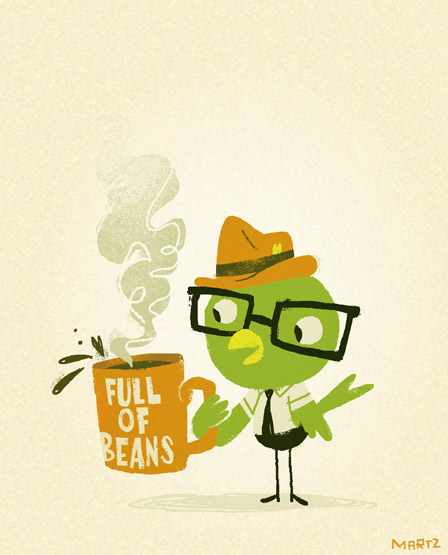
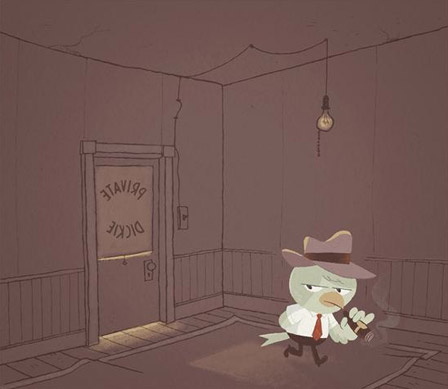
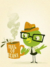
Bird
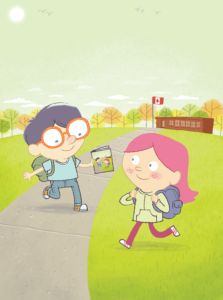
Squiggly Does It!
Patrick Iberi in Conversation with John Martz
Patrick Iberi: What childhood experiences have remained allied with your interest in cartoons and animation?
John Martz: I think it all stems from a love of books. In early grade school, I was told that I had difficulties paying attention in class and so it was arranged that I would spend time in the school library every day rather than just once a week, and so I’m sure I managed to devour or dissect every illustrated book they had. I knew the local public library’s collection of cartooning books inside and out, and I was always excited about the school’s Scholastic book order forms, and I always had a great collection of kid’s books growing up. So from an early age I was discovering Peanuts, MAD Magazine, Richard Scarry, early Disney animation, old comic strips that weren’t in my parents’ newspaper, and how-to-draw books for kids by Lee J. Ames and Ed Emberley. More than just discovering the cartoons themselves, I was discovering that there was a history here, and I think I found that as exciting as anything.
PI: Is there a basic technique associated with cartoons or is being adept at illustrating images sufficient skill?
JM: I don’t think there is a basic technique so much as there is the idea that the act of cartooning is abstraction and not pure illustration. I had an art teacher as a kid whose motto was “draw what you see, not what you know” and it frustrated me because not only did cartoons not look real, but it made drawing seem like a chore. So who cares if something’s a little off, if I’m having fun while drawing? Removing or distorting perspective and using simple shapes allows me to not have to think too hard about the execution. The simpler and more iconic an image is, the easier it reads, and the easier it is to draw, to be honest. In my own personal evolution as a cartoonist, discovering this process of distillation and abstraction has been as much an acceptance of my artistic limitations as it has been a conscious effort. As much as I love drawing, I hate having to work at a drawing. I recently came across a quote by Raymond Carver who said, “You’ve got to work with your mistakes until they look intended.” And that’s sort of what I’m doing – I love to draw, but I don’t think I can draw that well. I know I can make nice-looking images, though, so I’ve learned to adapt. Can’t draw a tree? Just use a few straight lines and draw the impression of a tree. Suck at perspective? Draw a straight-on profile. After a while, these little cheats become a part of how I think about imagery, and it becomes a lot easier to see the world like this, and to fold these techniques into how I draw everything.
PI: Your clients include Hallmark Cards, Yahoo!, Scholastic, and CTV to name a few. Are these brands reflective of your choice of work?
JM: Mostly, yes. Especially Hallmark and the work I’ve done for kids’ magazines. They’re the perfect venue for my bright, cartoony style. It’s becoming rarer that a client will ask for something outside of my style or personality since learning to only populate my portfolio with images indicative of the kind of work I want to continue doing.
PI: Can you to let us into the creative process of your work, talking about content, style and composition?
JM: Style is one of those things that I think will be a lifelong endeavor. I’m fascinated with the concept of simplicity in art – simplicity of line, concept, design, and execution – and it’s an incredibly difficult discipline to master. My natural impulse, at least, is to work at something until it is perfect, which ultimately results in failure I think. I never want my work to look laboured. Learning to leave an illustration alone, and to let its imperfections shine is counter-intuitive some times. Cartooning is like haiku; when it’s done right, everything gets distilled down to the simplest of forms. Ideas, images, emotions – all the excess gets trimmed away until you have their essence captured in just a few simple lines. On the occasions I’ve managed to succeed in that, it’s a wonderful feeling of accomplishment. I also struggle with straddling the line between digital and analog methods of production. I’m a techno-geek who loves new toys and electronics, so I quite enjoy using the latest pieces of software and tools for producing artwork. I use a Wacom Cintiq, which is a graphics tablet built into a display; this allows me to draw using the computer and directly onto the screen using a stylus. It’s an amazing piece of technology. It makes one’s digital workflow incredibly efficient and it allows me to quickly try new ways of using colour or textures which – for a commercial job – wouldn’t otherwise be time or cost-effective. But in working digitally, oftentimes the results can be too ‘perfect-looking’, and lacking in that human touch. So I tend to combine hand-drawn analog work with my digital toolbox and have lately been figuring out the right balance between the two, which includes trying to mimic traditional media and finding ways to add (or, if not add, then celebrate) mistakes.
PI: If you could add a tool to the computer to enhance your work, what would it be?
JM: I don’t know if there are necessarily any tools or features I would add, but I certainly wouldn’t mind some sort of robotic assistant to take care of the less fun aspects of being a freelance artist like filing, accounting, taxes and even sales.
PI: One feature of paramount interest is the lettering of your illustrations, which I assume is hand-lettered. Does this call attention to the presentation of your work or is there always an underlining reason for using a particular style of lettering?
JM: I’m constantly drawn to shapes of letters, and have enjoyed making fonts and designing with type. Typography and lettering can have a lot of character (no pun intended), and working with letters and words is no different from working with images when it comes to communicating or setting a mood. I don’t particularly see the two as mutually exclusive. I’ve been schooled by comics, Sesame Street, children’s books, film titles, book covers, cereal boxes… all of which seamlessly blend words and images. It’s second nature, I guess.
PI: Is having an applicable sense of humour a sin qua non or just a cliché for cartoonists?
JM: It’s certainly neither. To say it’s a cliché is to renounce the field’s rich history, which is rooted in humour and fun. But the term comic is a medium and not a genre after all. It is true that the word “cartoonist” still implies humour and perhaps a certain degree of triviality, but it’s a term that I think is going through some growing pains as more and more people are realizing that comics, as a medium, can do so much more than make people laugh.
PI: So what else do cartoons offer other than make people laugh?
JM: I don’t really know how to answer this question. Where do I begin? What do books, movies, songs, theatre, poetry, newspapers, magazines, novels, instruction manuals, textbooks, advertising, language, documentaries, photographs, ballet, martial arts, painting, sculpture, craft, textiles, jewelry, design, biography, propaganda, animation, puppetry, virtual reality, role playing, comedy, oration, blogging, sketchbooks, diary-keeping, editorials, essays, newsletters, sign painting, television, satire, parody, fine art, pop art, graffiti, opera, or rap offer other than any one single thing?
PI: The veteran cartoonist Dave Gibbons documents that there were a variety of restrictions placed on cartoonists by comic book publishers in the 70’s and 80’s. In his forward to Alan McKenzie’s How to Draw and Sell Comic Strips, he notes that some of these restrictions included exclusion of credits, which as a result, rendered the artist faceless. Do you think this imposed anonymity was in any way beneficial?
JM: That’s part of the industry that never intrigued me. I was never more than peripherally interested in superhero comics. I’m quite unfamiliar with that particular aspect of comic book history, and it’s not the sort of work I would ever do, so I can’t really say. But for me personally, Superman or Batman, for example, is not about the artist or the writer anyhow - it’s the character that matters. That’s not to say the talent behind those titles isn’t deserving of due credit, but I’m personally just not all that engaged by those kinds of comics or storytelling beyond their general mythology. I’m neither the right audience nor the right creator for that kind of work. If you look at any comic or illustration of ‘The Simpsons’, as an example; they’re all signed by Matt Groening, even though they were drawn by a nameless staff illustrator who’s sticking to a rigid style guide. On the business end, these types of comics are more about the corporate brand than they are about the person holding the pencil. Even ‘Garfield’ is drawn today by a team of uncredited artists all mimicking Jim Davis’s style and signing his name.
I worked as part of an in-house design team for several years, and I imagine working for a company-owned property like Batman or Garfield is a similar experience – that of being one cog in a larger wheel. A friend described working for DC as being a graphic designer as opposed to being a cartoonist.
PI: Would you consider any ideas of replicating your work in the electronic media; perhaps in the form of an animated series, interactive comic art or something of that nature?
JM: A big chunk of what I do as part of my job involves the Internet and technology in a broad way such that I no longer think of electronic media as ‘the alternative’. That said, I just want to continue doing the kind of work that makes me happy, and I’ll use whatever medium best suited to a particular project. I think interactive comics are an interesting idea, and I think there are probably innovative, creative ways to do them right, but most of what I’ve seen hasn’t interested me. The interactive features would need to be integral to the experience and not just superfluous animation or sound.
PI: Have you ever had to contend with any copyright issues as a cartoonist?
JM: Not yet, knock on wood.
PI: What next from you John? Do you have anything up your sleeves you want to share?
JM: Currently I’m in production of a kids’ graphic novel called Barbarian for Hire, written by fellow Toronto cartoonist Zach Worton.
PI: Thanks for your time and insightful response to my questions
JM: It’s been a pleasure, Patrick.